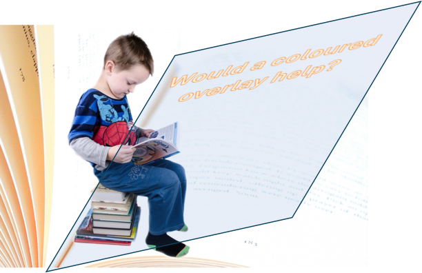
The idea that coloured sheets of plastic (overlays) can treat dyslexia is now viewed with some scepticism (we ourselves called it a Neuromyth). This is because high-quality randomised controlled trials, testing the effectiveness of overlays for dyslexia, found no consistent evidence that it could help improve reading accuracy (see, Evans & Allen, 2016).
However, a focus on whether overlays are a treatment for dyslexia distracts from an important separate question: do some children experience discomfort with some types of visual patterns and lighting conditions, and might this impact their performance in the classroom? Here, Daphne Jackson Research Fellow, Dr. Beverley Burke discusses the idea that a subset of children may benefit from visual adjustments when reading – and may indeed find some lighting conditions distracting in the classroom. This is a phenomenon called visual stress.
What is visual stress?
Visual stress is the inability to view certain spatial patterns, such as stripes and lines of text, without discomfort and/or distortion. It’s suggested that this condition may be related to the neurological response experienced by individuals with photosensitive epilepsy when exposed to flicker as these individuals are usually also sensitive to striped patterns.
“The idea is that the coloured filter reduces the unpleasantness in viewing text and therefore makes reading faster – and because there is less discomfort, sustainable for longer”
Visual stress is thought to be caused by excessive neural activation in the visual cortex, which some people are more susceptible to because of a neuronal hyperexcitability (Wilkins, 2021). Discomfort then results from the consequent metabolic load – the energy demands of the hyperexcited neurons. Why isn’t everyone affected? We certainly all experience some visual patterns as more ‘buzzy’ or uncomfortable. There are individual differences in the neurophysiological properties of the visual system, partially of genetic origin, including the balance of local excitation and inhibition, and it is likely that this makes a minority of individuals more vulnerable to discomfort.
Claims that coloured interventions aid reading are not new, in fact the first case report in the literature was over 65 years ago (Jansky, 1958). The idea is that the coloured filter reduces the unpleasantness in viewing text and therefore makes reading faster – and because there is less discomfort, sustainable for longer. It is still a matter of speculation why a coloured filter would be helpful in calming down a hyperexcitable visual cortex. One proposal is that the tint of the overlay acts to redistribute the excitation in the cortex that results from a visual scene, avoiding local regions in which the cortex is hyperexcitable (Wilkins, 2021).
How common is visual stress?
How common is visual stress among children? One way to estimate this would be to see how many children show an increase in reading rate when they are given coloured overlays. One study by Wilkins and colleagues which tested over two hundred 7 to 8-year-old UK children estimated the incidence at around 7% (Gilchrist in prep).
One challenge is that the particular colour of filter that works best for a given child may vary from one child to another, and these debates continue in the field. The generation of commercial products and patents which restrict access to stimuli have sometimes got in the way of careful scientific testing.
Discomfort when reading text, and the subsequent exploration of colour overlays, are manifestations of visual stress, but the phenomenon is broader. It includes discomfort with other striped patterns (say, light coming through Venetian blinds) and lighting conditions (as with flicker from LED lamps in some classrooms), and is linked to the still-broader notion of sensory sensitivity.
Inclusive classrooms
Debates also continue about how visual stress should be defined and the key features required for diagnosis (for updated 2025 guidance see Specific Learning Difficulties Assessments Standards Committee).
Lessons from the more recent transdiagnostic approach to neurodevelopmental conditions are that we would expect visual stress to be characterised by a dimension of severity, heterogeneity of presentation, and co-occurrence with other conditions (Astle et al., 2022). For example, it might be useful to view visual stress as potentially co-occurring with dyslexia, which would imply that the use of colour overlays may aid a subset of children who are having difficulty reading.
The transdiagnostic approach encourages educators to make classrooms more inclusive. In one sense, disability is being produced by the social conditions we create. For example, if cultures had determined they would design writing to be in green ink on a red background, then individuals with Colour Vision Diversity (formerly Colour Blindness) would experience reading deficits. In the same way, culture has determined that text will be presented monochromatically as black ink on a white background, and for certain scripts and fonts, as a series of predominantly horizontal and vertical lines. This causes some individuals with sensory cortices prone to hyperexcitability problems with reading, and problems with flickering lighting in classrooms. (You may be thinking that some children show particular sensitivity to auditory stimuli too – that’s true, but not our topic today!)
The inclusive approach encourages designing classrooms to be accommodating of neurodiversity. In this case, it would mean avoiding flicker and stripes in lighting, allowing students the opportunity to vary font size and line spacing, and making available colour overlays within schools for trial and error to see if these aid reading. Perhaps more important than resolving definitions and diagnoses is an awareness among teachers and students of visual stress, and that when it comes to reading, coloured overlays or other interventions such as colour paper may be of help for some children.
Find out more
Professor Arnold Wilkins [Visual Stress.info], an expert in visual stress and reading, recently gave a seminar as part of the CEN series, and his talk can be found here [CEN – Vision of the classroom as unnatural and uncomfortable] and recent book here [Vision, Reading Difficulties and Visual Stress]. His take home message from the talk was this: “In the classroom, test for flicker using slo-mo on your smartphone (if the lighting flickers, campaign to change it). Select larger text if you can (avoid the stigma). Avoid teaching in front of Venetian blinds. Avoid bright (strongly saturated) colours in the classroom. Check if the words wobble on the page for a child, and if they do, refer the child to an optometrist who has an interest in colour overlays (https://ceriumvistech.com/find-your-local-specialist/).”
References
Astle, D. E., Holmes, J., Kievit, R., & Gathercole, S. E. (2022). Annual Research Review: The transdiagnostic revolution in neurodevelopmental disorders. Journal of Child Psychology and Psychiatry, and allied disciplines, 63(4), 397–417. https://doi.org/10.1111/jcpp.13481
Evans, B. J. W., & Allen, P. M. (2016). A systematic review of controlled trials on visual stress using Intuitive Overlays or the Intuitive Colorimeter. Journal of Optometry, 9(4), 205-221. https://doi.org/10.1016/j.optom.2016.04.002
Gilchrist, J. M. (in preparation). To be updated!
Jansky, J.J. A case of severe dyslexia with aphasic-like symptoms. Bulletin of the Orton Society 8, 8–11 (1958). https://doi.org/10.1007/BF02657600
Wilkins, A. (2021). Visual stress: origins and treatment. CNS, Vol. 6. January 2021. Retrieved from: https://repository.essex.ac.uk/30132/7/74-86_Oruen_Vol-6_Jan-2021.pdf
Wilkins, A., Lewis, E., Smith, F., Rowland, E., & Tweedie, W. (2001). Coloured overlays and their benefit for reading. Journal of Research in Reading, 24(1), 41–64. https://doi.org/10.1111/1467-9817.00132